Empirical and analytical studies of global inequality have become more common recently (Cristiansen and Jensen 2019, Alderson and Pandiam 2018, Darvas 2019, Niño-Zarazua et al. 2017). This is due to two reasons. First, the data to carry out such studies (from representative national household surveys) have become more available and accessible. This mean both fielding such surveys more frequently – in principle annually (Africa still remains a laggard in this) – and letting researchers have access to micro (household-level) data. There has been a clear improvement in the latter, most notably in the Middle East.
Second, such studies, especially after the political success of the ‘elephant graph’ (introduced in Milanovic 2012 and, in more detail, by Lakner and Milanovic, 2013, 2016), have revealed certain key global economic and political features. These include (1) high income growth among Asian middle classes, who are located around the median of the global income distribution; (2) a lack of such growth among the Western middle classes located around the 80th percentile of the global income distribution; and (3) the fast growth of income among the global top 1%. The interactions between these three points underly several political issues: Did the growth of the Asian middle classes take place on the back of the Western middle classes – or, in other words, is stagnation of Western incomes causally related to the progress of Asia (1 and 2)? Is there a tacit coalition of interests between the global plutocrats and Asian middle classes as they both are beneficiaries of globalisation (3 and 1)? And finally, is there an economic estrangement between Western middle classes and their compatriots from the top 1 percent (2 and 3)? Did ‘disarticulation’ – top national classes linked to the rest of the world and the rest consigned to the stagnant hinterland – move North, as I argued in Milanovic (2015)?
Many of these debates were carried on during the past ten years. Yet, they were based on relatively old data covering only the period up to the 2008 Global Crisis. The Paris School of Economics produced an update of global inequality in their first Global Inequality Report published in early 2018 (Alvaredo et al. 2018), but the actual number of countries included in the exercise was small.
The objective of my recent paper (Milanovic 2020) is to survey the developments in the global income distribution after the Global Crisis and bring the analysis up to 2013-14. It is worth noting that researchers now have much more detailed data than was the case ten years ago. In this new paper, I use the data from 136 countries (for 2008) and 131 countries (for 2013), covering between 94% and 96% of the world’s population and output.
Not only is the country coverage much wider now, but the data from all these countries are micro- (household-)based and, for each of the countries, we can create 100 percentiles with their average per capita incomes. There are no income estimates or simulations. This was not possible in the 1990s or even later because, for many countries, researchers either had to use the published tabulations and thus depend on whatever definition of income the statistical office used and however many groups it ‘sliced’ the distribution into, or use projections of often dubious quality. The problem was acute with Chinese data, with the National Bureau of Statistics refusing to supply micro data from its large annual household surveys. This unfortunately has not changed, but the National Bureau of Statistics now provides a nationally and regionally representative sample of data taken from the survey so researchers now do have access to household-level data.
Another large county, India, also presented problems. The typical survey used for India was its National Sample Survey (NSS), run from 1952 onwards, which uses consumption (not income) as its welfare aggregate. But the NSS was increasingly found to be at odds with reality, seriously underestimating consumption at the top of the distribution and showing implausibly low levels of inequality. We now have a series of income surveys for India which provide a much more realistic picture and reveal that in terms of inequality, India looks very similar to Latin American countries.
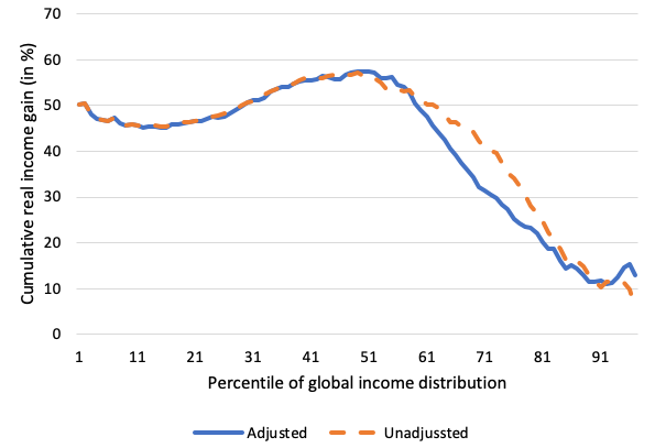
Do new data show charges in the global income distribution after the 2008 crisis? The shortest answer is that the situations for findings 1 and 2 are about the same, but finding 3 no longer holds. Figure 1 displays the global growth incidence curve for the period 2008-13; the horizontal axis shows global percentiles, ranging from the poorest on the left to the richest on the right; the vertical axis shows the real cumulative per capita growth between the two years calculated in constant PPP (equal purchasing power parity) prices. The Asian middle classes have continued, and even accelerated, their growth (about 60% during the five years; finding 1); the Western middle classes have registered positive, albeit slow, growth (some 10% during the same period; finding 2). Thus, not much has changed there since the Global Crisis.
What has changed, though, is the evolution of incomes at the very top of the global income distribution. Even after adjusting for the likely underestimation of national income distributions’ tops, the growth among the richest global 1% or 5% was only about 15%, or less than 3% per annum on average.1 Looking at the example of the US, whose citizens account for almost one-half of the global top 1%, it cannot be ruled out that the rich have seen a rebound in their incomes between the end of the period studied here and the Covid-19 crisis. However, to investigate that we shall have to wait for several years until the data from at least some 130 countries become available.
Figure 1 Global growth incidence (GIC) curve with national top income adjustments and without adjustments
Note: Cumulative growth 2008-13, in percent, in international dollars; full anonymous sample. This is a comparison of global income-adjusted and non-adjusted (reported) global GICs, both based on the full sample of countries.
The shape of the growth incidence curve in Figure 1 no longer looks like the famous elephant – the ‘trunk’ is now much lower that it was in 2008-13. However, one should note that even if the underlying regional income changes are the same, the shape of the curve need not stay the same. This is because the growth of Asian incomes moves the bulk of the Asian population from the middle of the global income distribution towards the higher percentiles. Thus, in the years to come, if the developments in Asia and in the West remain exactly the same, the bulge of growth will no longer be in the middle of the global distribution, but around the higher end (say, around the 70th percentile).
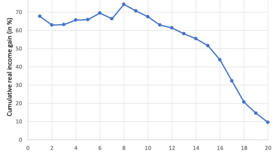
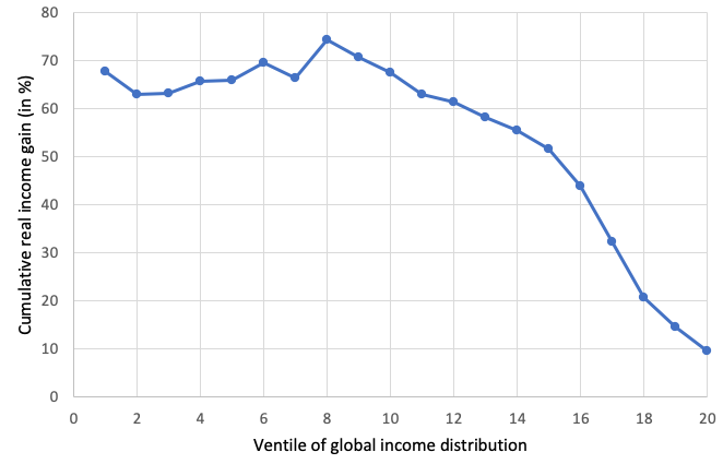
This is why a better way to look at the results consists in fixing the position of country/percentiles (our key unit of observation) at the place where they were in the original year (here 2008) and then calculating the growth rates over these fixed percentiles. The growth incidence curve that does that (the ‘quasi non-anonymous curve’) is shown in Figure 2. It differs from Figure 1 by highlighting more clearly the fast growth among the low percentiles of the global income distribution and a much slower growth at the top. Note also that the higher growth below the median (tenth ventile) shown in Figure 2 compared to Figure 1 means that by 2013, these poor percentiles have moved upwards in the distribution, and explains why the most significant increase in Figure 1 is around the median of the global income distribution.
Figure 2 Cumulative percentage growth of per capita income (in PPP dollars) at different points of the global income distribution, 2008-13
Note: Quasi-non-anonymous balanced panel. The graph shows cumulative income growth between 2008 and 2013 for 20 ventiles of global income distributions with each ventile’s composition (country/percentiles within it) ‘fixed’ as it was in 2008. It thus shows the average growth of country/percentiles that were at a given position in 2008 over the next five years.
Broadly speaking, the post-2008 period was good for the globally poor and for the global middle class; it was not good for the Western middle classes and the global top 1%. Perhaps one set of numbers may illustrate these developments. The US median (50th US percentile) registered cumulative growth of less than 4% between 2008 and 2013 and its global income position, on account of slow growth, deteriorated, going down from the 94th to 93rd percentile. Similarly, Italy’s median slipped from the 89th to the 84th global percentile and Britain’s from the 94th to the 90th. On the other hand, China’s median income more than doubled and its global income position went up from the 51st to the 60th percentile. Likewise, the Indian median grew by 66% and its global income position improved from the 21st to the 24th global percentile.
As these numbers show, Western medians (implicitly, the Western middle classes) are still much richer than those of the populous Asian countries. But if developments from the past three decades continue for another 20 years, the gap between the West and Asia will shrink further and will eventually entirely disappear.
A new reality will then be faced by the Western middle classes. For the first time since the Industrial Revolution, they might drop out the global top 20%. In other words, the upper part of the global income distribution will become regionally, nationally and racially much more diverse, with a much greater representation of Asian populations. The change could be rather abrupt because of the size of Asian populations. As they displace the Western percentiles, they could push them relatively quickly down because the large Asian populations may, in their ascent, take over several percentiles and crowd out those who were there before. One could ask, does this really matter? In some ways, it may not because people do not the necessarily look at, or know, their global income positions. They are more concerned with their national, not global, pecking order. However, in other ways it may matter, especially in a globalised world where consumption patterns are worldwide. Certain premium goods and services that are consumed by the global top of income distribution (foreign travel, the newest types of cars, mobile phones, or whatever is the most technologically advanced good at a given point in time) may become inaccessible to those who are no longer part of the global top. The adjustment could be rather significant, and its political consequences should not be written off or minimised. This may be the economic counterpart of the Asian century, as the global ascent of Western middle classes accompanied the American century.
References
Alderson, A S and R K Pandiam (2018), “What is Really Happening with Global Inequality?”, Sociology of Development 4(3): 261-281.
Alvaredo, F, L Chancel, T Piketty, E Saez and G Zucman (2018), World Inequality Report 2018, Harvard University Press.
Christiansen, C O and S L B Jensen (eds) (2019), Histories of Global Inequality, Springer.
Darvas, Z (2019), “Global interpersonal income inequality decline: The role of China and India”, World Development 121: 16-32.
Lakner, C and B Milanovic (2013), “Global income distribution: from the fall of the Berlin Wall to the Great Recession”, World Bank Working Paper No. 6719.
Lakner, C and BrBanko Milanovic (2016), “Global income distribution: from the fall of the Berlin Wall to the Great Recession”, World Bank Economic Review 30(2): 203-232.
Milanovic, B (2012), “Global income inequality in numbers: in history and now--An overview”, World Bank Working Paper 6259.
Milanovic, Branko (2015), “Disarticulation goes North”, Global Inequality blog, 16 November.
Milanovic, B (2020), “After the crisis: the evolution of the global income distribution between 2008 and 2013”, Stone Center on Socio-Economic Inequality Working Paper No. 18.
Niño-Zarazua, M, L Roope and F Tarp (2017), “Global inequality: relatively lower, absolutely higher”, The Review of Income and Wealth 63(4): 661-684.
Endnotes
1 Thus, the global Gini went down from 0.66 to 0.62; the global Theil index fell even more, from 91 to 76. Global inequality continued its downward slide which started around the turn of the 21st century.


