How much income inequality is there in Latin America? Is inequality today higher or lower than it was in the 1990s, in the aftermath of the debt crisis? Has the evolution of inequality followed a particular pattern?
Debates on inequality levels and trends are rampant, and Latin America is no exception (see VoxEU featured videos by François Bourguignon and James Galbraith).
Drawing on a comprehensive compilation of inequality measures, in a recent paper (Alvaredo et al. 2024) we review the measurement of income inequality in the region over the last seven decades. When surveying the literature and data compilations on income inequality, one is faced with the fact that there are often different estimates for a particular country in any given year.
Any attempt to understand what is really happening must confront this fact head on and seek to understand it. Are all but one of these estimates wrong? Is there one, unequivocally right way to measure income inequality? And if not, what do we really know about the phenomenon?
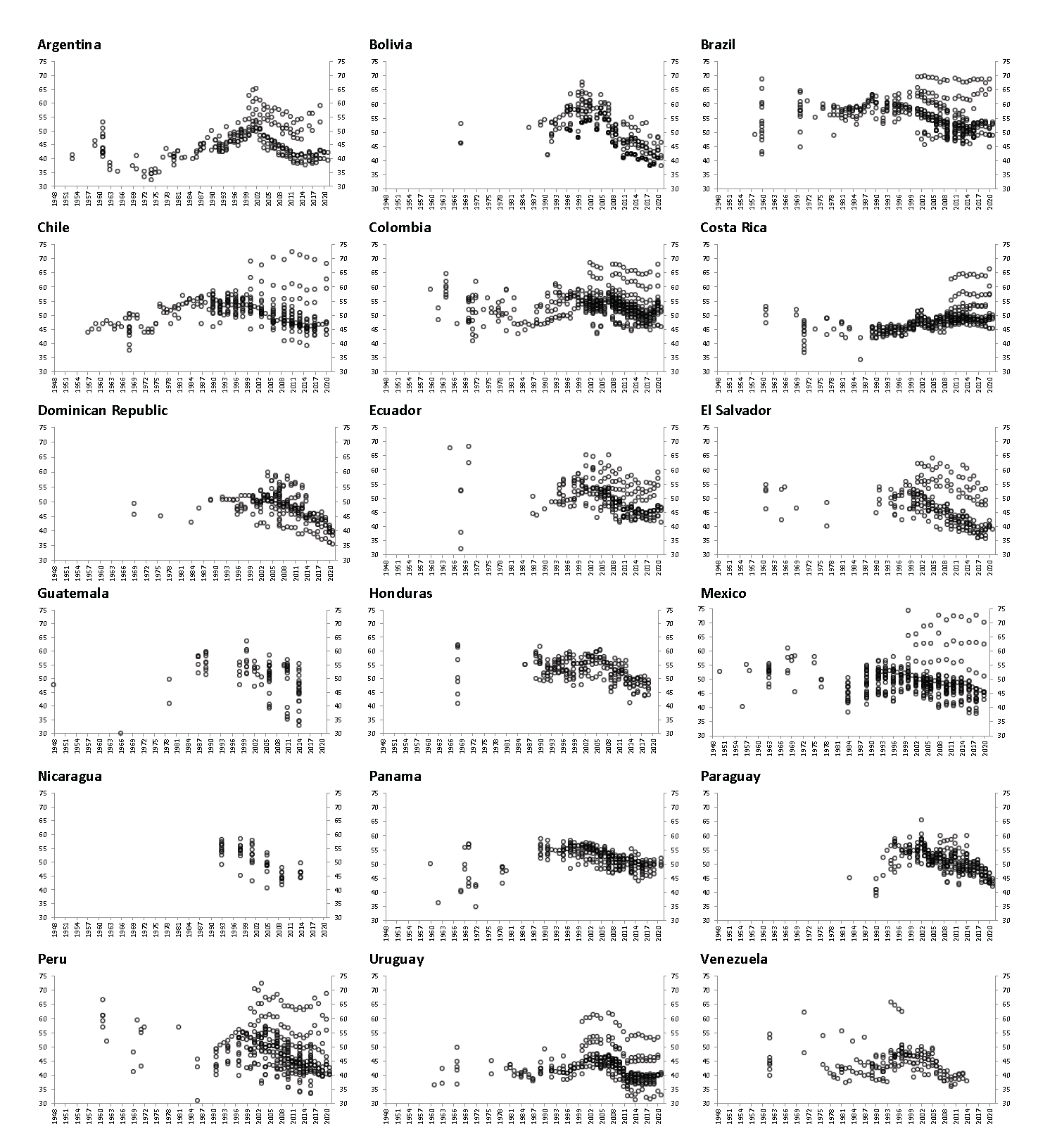
Figure 1 contains roughly 75 years of Gini coefficients
(the most frequently used inequality measure) for 18 Latin American countries, drawing from a variety of sources. These sources include four databases that produce their own harmonised estimates from household surveys (SEDLAC, CEPAL, PovcalNet-PIP and LIS), secondary source estimates collected by aggregators such as WIID, estimates that correct household surveys with administrative data (De Rosa et al. 2022), and additional individual studies.
Figure 1 Gini coefficients in Latin America and the Caribbean, 1948-2021
Source: Figures 3a and 3b in Alvaredo et al. (2024).
The resulting range of inequality estimates is considerable. The range is relatively narrow for some countries and periods, such as (urban) Argentina in the 1970s or Costa Rica in the 1990s. In other cases, the range is rather staggering: a reader asking what the Gini coefficient for income was in Brazil in 1960 can find answers ranging from 0.43 to 0.70. And this is not a feature exclusive of the earlier part of the time series: the range for Chile in 2010-11 is also from 0.40 to 0.70, and for Mexico in 2017 it is even greater.
It is important to note that all these estimates are not fully comparable so that the observed range should in no way be considered as the size of the measurement error in the standard statistical sense. Figure 1 draws on about 5,600 highly diverse Gini coefficients available by country: national but also rural and urban Ginis; Ginis for total income and for labour earnings only; Ginis for total monetary income and also for income including nonmonetary income such as imputed rent for owner’s occupied housing and consumption of own production; and, especially, Ginis based on household surveys only and Ginis estimated with household surveys corrected with administrative data such as tax returns, and Ginis adjusted to match aggregates in national accounts. The last two, as stated below, are some of the main factors behind the range of the bands observed from 2000 onwards, the starting point from which these comparisons are possible with available estimates.
When the data are narrowed to the four harmonised databases mentioned above, the band width is considerably reduced. For most countries, this harmonised series is available after the 1990s. The average range (over time) for this set of estimates is typically below two Gini points – a much more acceptable degree of uncertainty about inequality levels. Nonetheless, even if restricting ourselves to these four databases, the differences are three points or above in three countries, namely, Chile, Guatemala, and Venezuela.
How unequal is Latin America?
Based on the previous discussion, how unequal is Latin America? Relying on the four harmonised databases from comparable surveys, the average Gini coefficients for the 2010s are (from most to least unequal): Brazil 52.5, Colombia 52.2, Panama 50.7, Guatemala 50.4, Honduras 50.4, Paraguay 49.6, Costa Rica 48.9, Mexico 48.4, Nicaragua 47.5, Chile 46.1, Ecuador 45.9, Bolivia 45.6, the Dominican Republic 45.3, El Salvador 41.4, Peru 44.4, Venezuela 43.8 (in the 2000s), Argentina (urban) 41.1, and Uruguay 40.4.
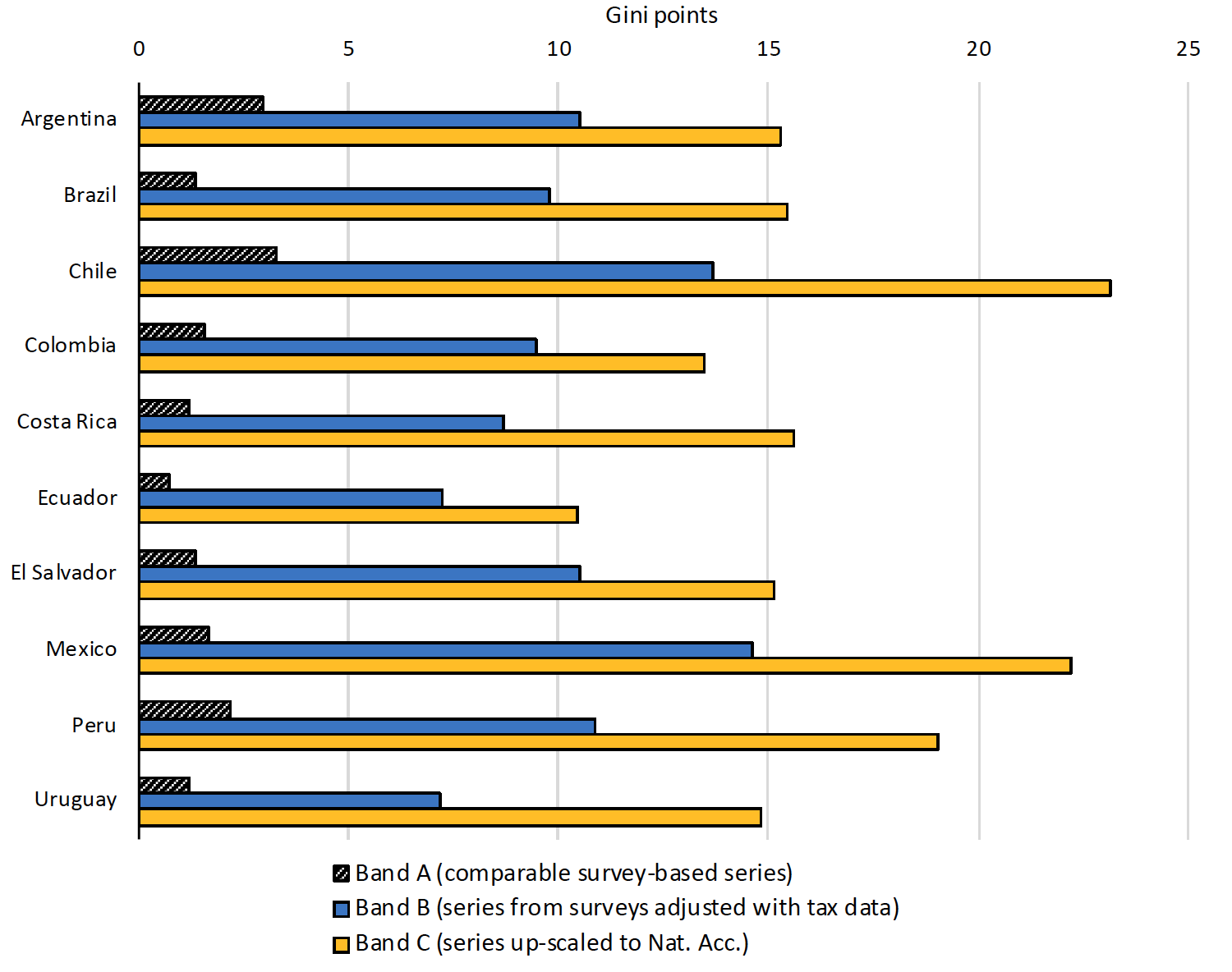
However, Gini coefficients are ten percentage points higher on average when information from tax data is used to correct for top incomes misreporting, and more than 15 percentage points higher when attempts are made to scale up to national accounts estimates of national income (Figure 2).
Unfortunately, these methods involve a variety of assumptions and decisions which cannot be subject to mathematical or statistical validation, and to which results are quite sensitive (De Rosa et al. forthcoming). This gives rise to a situation of considerable uncertainty about the exact levels of income inequality in the region: household surveys are almost certain to underestimate inequality, but corrections to them are not robust and may, in some cases, overestimate it. So far as levels are concerned, we live in a world of inevitable (for now, at least) uncertainty, which we represent by means of a set of inequality bands, the width of which is shown, for the recent period, in Figure 2.
Figure 2 Average width of inequality bands over 2000-2020: Among HHS-based measures; including tax adjustments; and including scaling up to SNA aggregates
Source: Figure 12 in Alvaredo et al. (2024).
The evolution of inequality measures
More than the levels of inequality, what may matter most for scholarly analysis and policy design is the evolution of comparable inequality measures over time. In this respect, it is reassuring that the evolution of inequality appears to broadly follow similar patterns regardless of the source or the definition. Although the evidence prior to the 1970s is too fragmentary and difficult to compare, clearer patterns emerge for the last fifty years. The central feature of these patterns is a broad inverted-U curve, with inequality rising in most countries prior to (or in some cases during) the 1990s, and falling during the early 21st century, at least until the mid-2010s, when trends appear to diverge across countries (Figure 1). This broad pattern is modified by country specificities, with considerable variation in timing and magnitude. Different countries experienced peaks and troughs in different years and the magnitude of the rises and declines were different.
For some countries, such as Guatemala and Nicaragua, where household surveys started later and other sources were not available, we only observe measures since the 2000s. In those cases, the observed trend is consistent with the declining part of the inverted U. For the series that combine household surveys with tax data and national accounts, we also only observe measures since 2000. It is reassuring that in these cases the observed trend is also generally consistent with the declining part of the inverted-U.
Does this broad inverted-U pattern reflect a gradual mean-reverting process where different short-lived, possibly common, shocks drive changes but take time to fade? Or, instead, do they reflect more permanent changes stemming from structural transformations? Or is it a combination of both? Oil price shocks and rising interest rates in the 1970s, and the debt crisis followed by the structural adjustment in the 1980s and the 1990s, are plausible suspects during the period of rising inequality, while rising commodity prices in the 2000s may have contributed on the descending side of the inverted-U. These global phenomena will appear as correlate shocks for Latin American countries, while country specificities will account for differences in the exact timing and magnitudes. There are also plausible structural factors at work, such as declining returns to schooling (and in some cases, experience) during the 2000s, as educational expansions outpaced the demand for skills (Lopez-Calva and Lustig 2010). Higher minimum wages, the drop in family size and more progressive social policies are also part of the story. While it is difficult to causally decompose the overall inequality changes at a given point of time into the effects of each of these forces, we know that all of them played a role at some stage.
Conclusion
Enormous progress has been made in the region over the years in data collection to measure inequality. Some of this progress, particularly as it relates to capital incomes and the incomes of high-earning households, remains incomplete. While this generates a humbling sense of uncertainty about exact levels of inequality, it is also a promise of further progress ahead, including improvements in the quality of all distributional data sources – surveys, administrative records, and national accounts estimates, etc. In the meantime, the existence of a relatively robust broad dynamic pattern – with country-specific peculiarities – provides researchers with plenty of challenging questions about drivers and mechanisms.
References
Alvaredo, F, F Bourguignon, F Ferreira and N Lustig (2024), “Inequality Bands: Seventy-five years of measuring income inequality in Latin America”, CEPR Discussion Paper 18852.
Alvaredo, F, F Bourguignon, F Ferreira and N Lustig, (2023), “Seventy-five years of measuring income inequality in Latin America”, LSE-International Inequalities Institute WP 111.
De Rosa, M, I Flores Beale and M Morgan (2022), “More unequal or not as rich? Revisiting the Latin American exception”, Stone Center Working Paper 53.
De Rosa, M, N Lustig and V Martinez Pabon (forthcoming), “Fiscal redistribution when accounting for the rich in Latin America”, CEQ Working Paper Series.
Ferreira, F and N Lustig (2015), “Appraising cross-national income inequality databases”, Special issue, Journal of Economic Inequality 13.
Lopez-Calva, L F and N Lustig (2010), Declining Inequality in Latin America: A Decade of Progress?, Brookings Institution Press.


